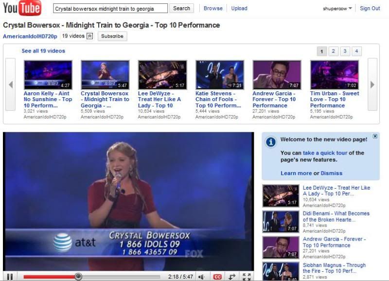
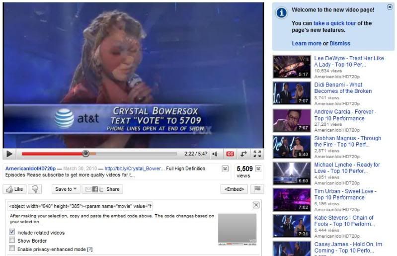
Anyways, youtube also unveiled a new interface for users and it looks like every site wants to be like facebook, in all its streamlined glory. I think youtube succeeded, whereas some sites like multiply and friendster were trying to hard. I mean, multiply just copied a lot of things off facebook, and it's not flattering at all. During the pre-facebook era, multiply was my go-to for sharing all my pictures. But now, since it's more practical and accessible for all my friends to view pictures on facebook, I'm shifting my gears and heading for that big blue F. Too bad though, multiply used to be a good site but now it just looks cheap, as in Friendster-cheap.
Since I can't complain as much for youtube, since it's indispensable and a godsend, I'm just going to rave about how the layout is easy on the eyes.

I like how there's no more awkward scroll buttons and there are less constricting lines.

I also like how, instead of the 5-star rating option, there's just the "Like" or "Don't like" (!). It makes it simpler and well, I'm too lazy to set a criteria for star ratings so it works for me.
I'm thinking of a lot of things to blog about right now. First on the list would be my favorite Idol performances last night. On that note, I never blogged about American Idol since the time I posted the Barney girl turned Dominatrix audition. At least this keeps me preoccupied.
No comments:
Post a Comment